Subject: mailing-list for TeXmacs Users
List archive
From : Julien Frontisi <address@hidden>- To: address@hidden
- Subject: Re: : [TeXmacs] texmacs logos
- Date: Wed, 28 Mar 2012 14:40:08 +0200
As Alvaro pointed out, it is not necessary to have the exact same logo at all size, or is it ?
There could be variations to simplify them at smaller sizes. To get recognized at small sizes, I think
icons need only have original colors that stand out, like 13 or 14. But the others are very nice too.
For example, a small #9 could be cropped to be a little bigger (no need for shading at this size),
keeping only tau and mu to fill up the sign. Also, roundish is significantly more legible for isoperimetric inequality reasons.
Keeping the 3-letter diamond-shaped for bigger icons.
Similar changes can be done on others.
Julien
Le 28 mars 2012 à 13:17, Massimiliano Gubinelli a écrit :
I think that the current logo is very well crafted. The negative point is that it has nothing to do with the software: does not convey any idea of simplicity or power or beauty which are caracteristic of texmacs. It can be a logo for a chip design software, or for a number crunching app, but I do not see how it fits with texmacs and with the image we want to have for this software. This said, I have difficult time to make something which has the same visual appeal in any situation...bestmaxOn 28 mars 2012, at 10:21, address@hidden wrote:Actually, i agree with you : the current is not bad too. It could be modified (slightly)...
RG
-----E-mail d'origine-----
De : Peter Rapčan <address@hidden>
A: texmacs-users <address@hidden>
Envoyé le : Mardi, 27 Mars 2012 20:18
Sujet : Re: Re : [TeXmacs] texmacs logos
I like # 9, too. But I also like the current texmacs logo.
Best,Peter.
On Mar 27, 2012, at 8:39 AM, address@hidden wrote:I like # 9,
best regards,
Richard Gomez
-----E-mail d'origine-----
De : Alvaro Tejero Cantero <address@hidden>
A: texmacs-users <address@hidden>
Envoyé le : Samedi, 24 Mars 2012 20:35
Sujet : Re: [TeXmacs] texmacs logos
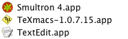
It is possible to use a variation of the main theme for icons, as long
as it is recognizable. This could also be the approach for the 'made
with TeXmacs' stamp. The simpler designs are those best suited for an
icon, in a high-contrast variant.

-á.


On Sat, Mar 24, 2012 at 17:22, Julien Frontisi <address@hidden> wrote:
> Very nice work, congratulations again!
> I took screenshots of your artwork in a list of applications in MacOS X's
finder to compare icons in situ.
> The funny thing is that those I prefer (like #8) are not necessarily the best
in small size, in terms of recognizability.
> Here is a link to all pics.
> http://pc1sl.free.fr/pc1/tm/logo/
>
> Julien
>
> Le 24 mars 2012 à 11:52, Gubinelli Massimiliano a écrit :
>
>> I've added two new attemps to a new texmacs icon (assuming the name won't
change) at the end of this page:
>>
>> http://www.ceremade.dauphine.fr/~mgubi/tml/tmlogo.htm
>>
>>
>> best
>> massimiliano
>>
>>
>>
>

- Re: [TeXmacs] texmacs logos, (continued)
- Re: [TeXmacs] texmacs logos, Miguel de Benito Delgado, 03/24/2012
- Re: [TeXmacs] texmacs logos, Miguel de Benito Delgado, 03/24/2012
- Re: [TeXmacs] texmacs logos, El.Douwen, 03/24/2012
- Re: [TeXmacs] texmacs logos, Henri Girard, 03/24/2012
- Re: [TeXmacs] texmacs logos, Julien Frontisi, 03/24/2012
- Re: [TeXmacs] texmacs logos, Alvaro Tejero Cantero, 03/24/2012
- Re : [TeXmacs] texmacs logos, richardetdave, 03/27/2012
- Re: Re : [TeXmacs] texmacs logos, Peter Rapčan, 03/27/2012
- Re : : [TeXmacs] texmacs logos, richardetdave, 03/28/2012
- Re: : [TeXmacs] texmacs logos, Massimiliano Gubinelli, 03/28/2012
- Re: : [TeXmacs] texmacs logos, Julien Frontisi, 03/28/2012
- Re: : [TeXmacs] texmacs logos, Peter Rapčan, 03/28/2012
- Re: : [TeXmacs] texmacs logos, Massimiliano Gubinelli, 03/28/2012
- Re : : [TeXmacs] texmacs logos, richardetdave, 03/28/2012
- Re: Re : [TeXmacs] texmacs logos, Peter Rapčan, 03/27/2012
- Re : [TeXmacs] texmacs logos, richardetdave, 03/27/2012
- Re: [TeXmacs] texmacs logos, Gubinelli Massimiliano, 03/26/2012
- Re: [TeXmacs] texmacs logos, Miguel de Benito Delgado, 03/26/2012
- Re: [TeXmacs] texmacs logos, Alvaro Tejero Cantero, 03/24/2012
Archive powered by MHonArc 2.6.19.